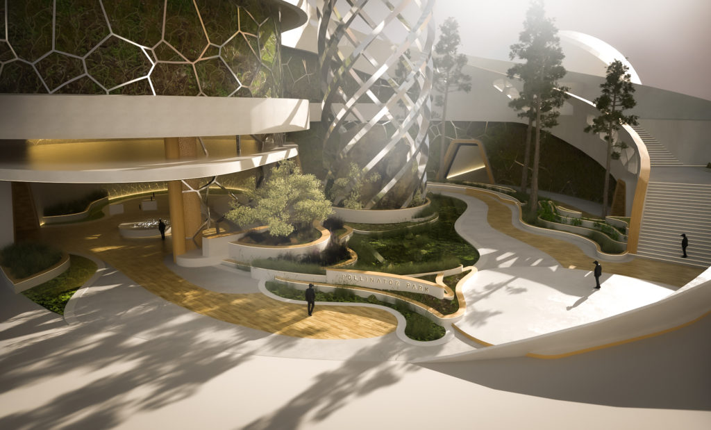
The Concept Art of Pollinator Park
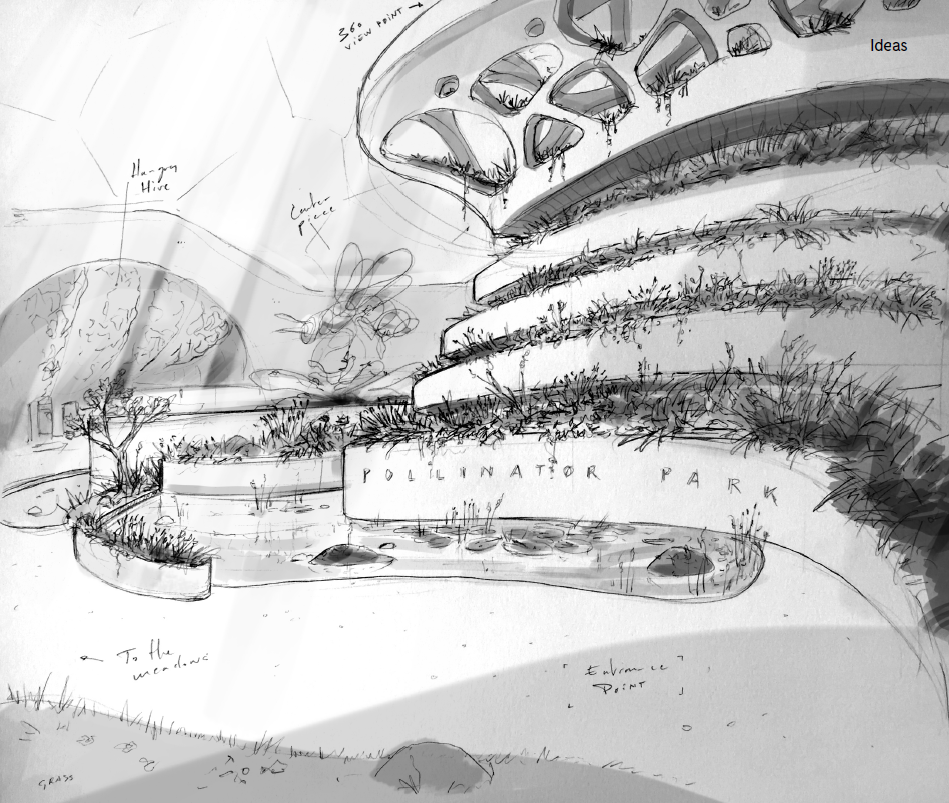
With a few diagrams and sketches, and a bunch of mood board images we reached out to Bart Lommelen (Fixion) to start shaping the visual atmosphere of Pollinator Park. It’s not the first time we worked with Bart and it will definitely not be the last. We’re sure you’ll understand why when…
While the backstory of Beatrice and Pollinator Park was in production we also started with the first concepts for the look and feel of the park. We knew which topics had to be integrated in the experience and used that as a base.
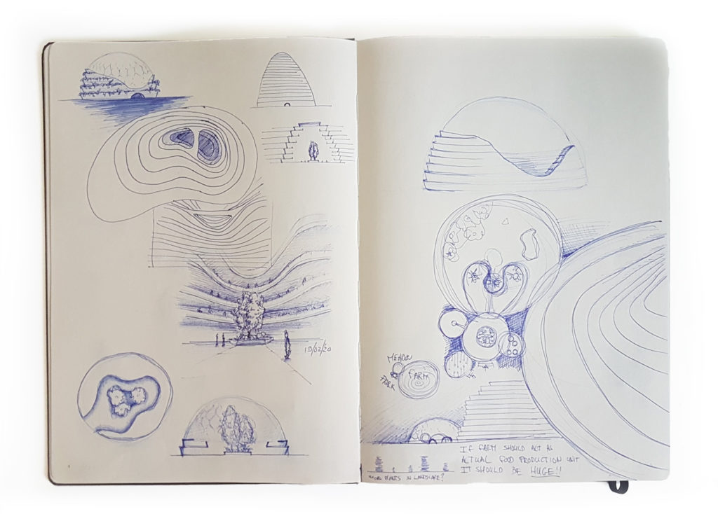
Focus on the inside
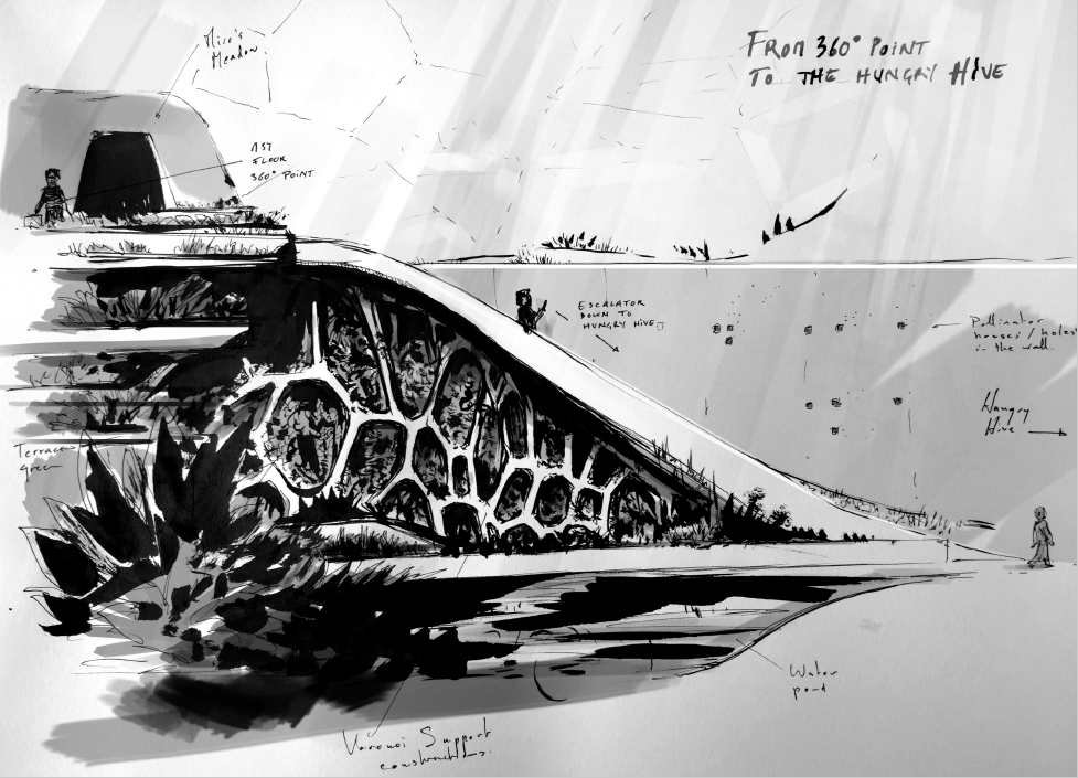
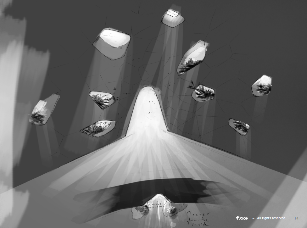
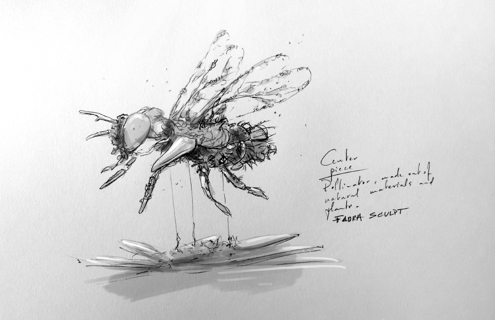
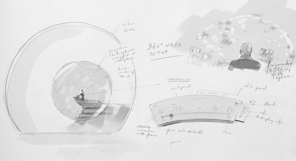
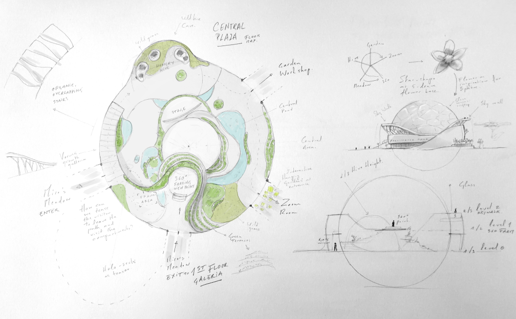
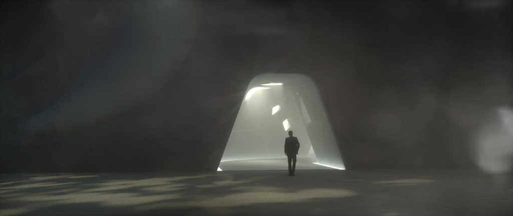
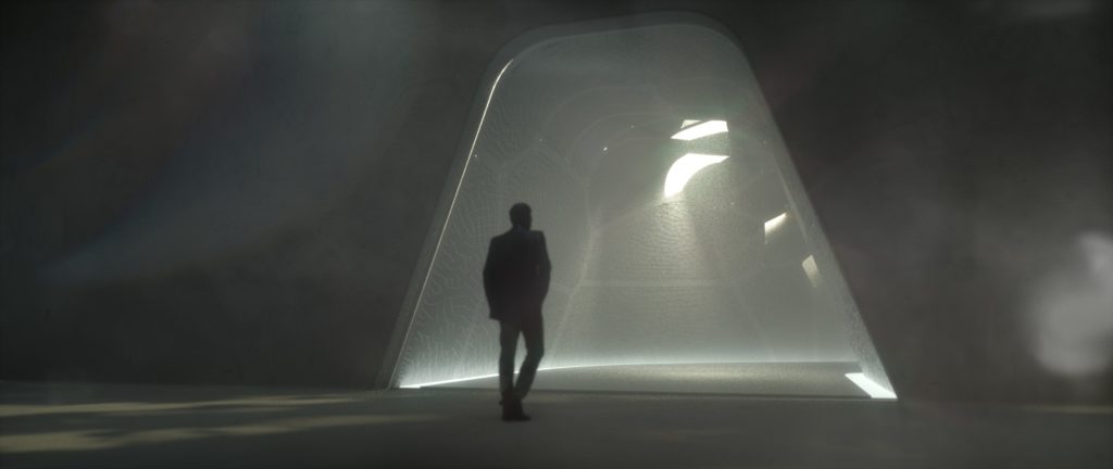
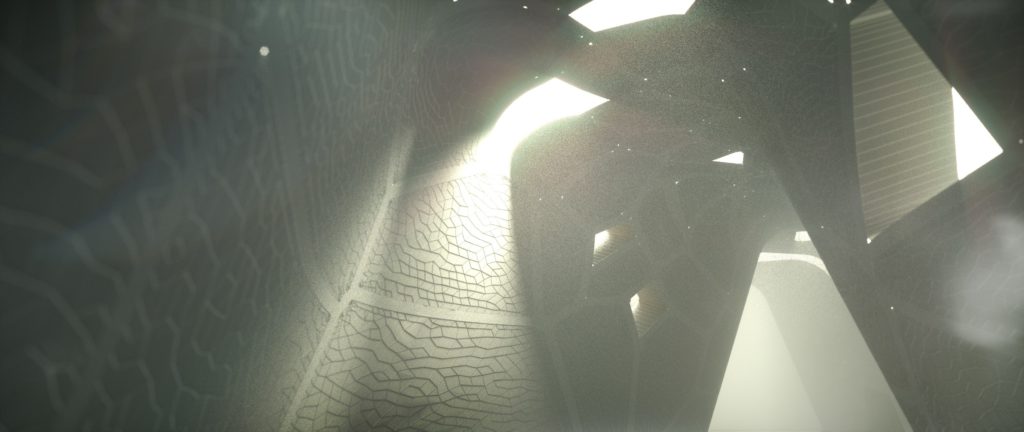
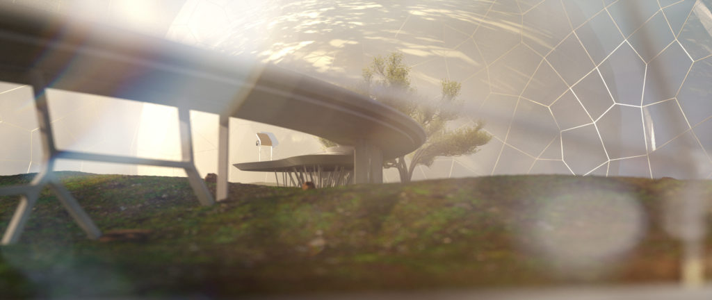
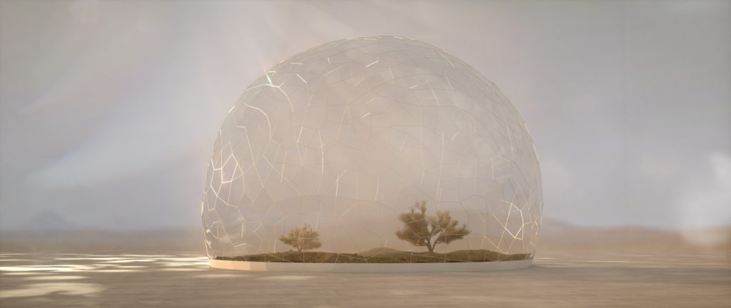
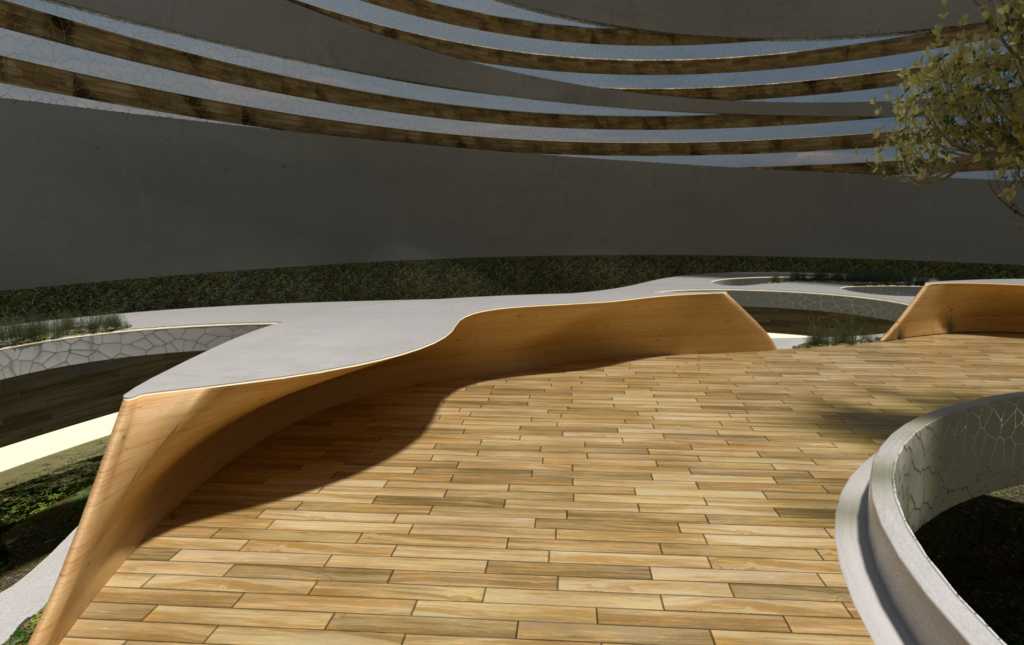
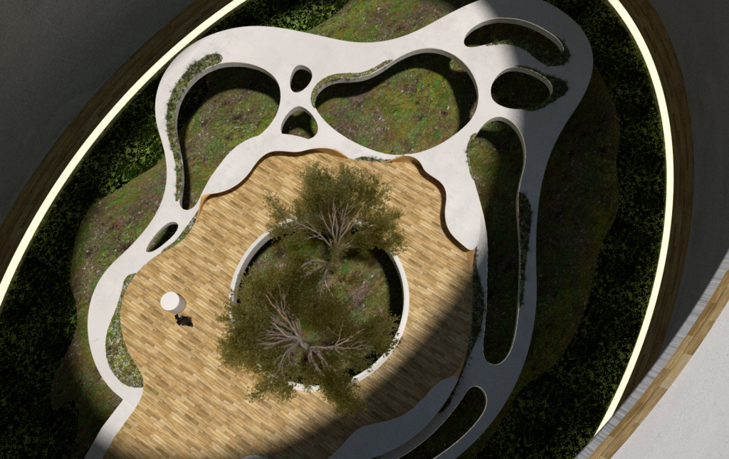
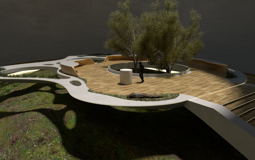
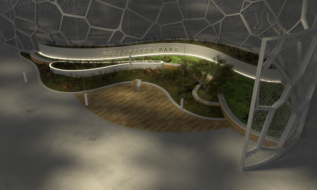
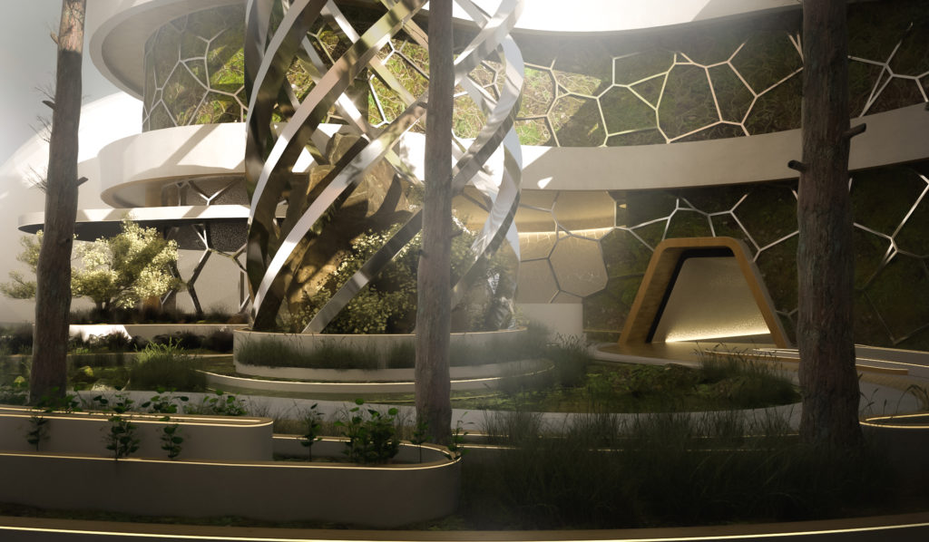
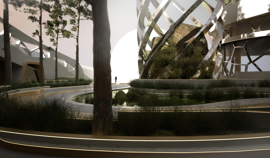
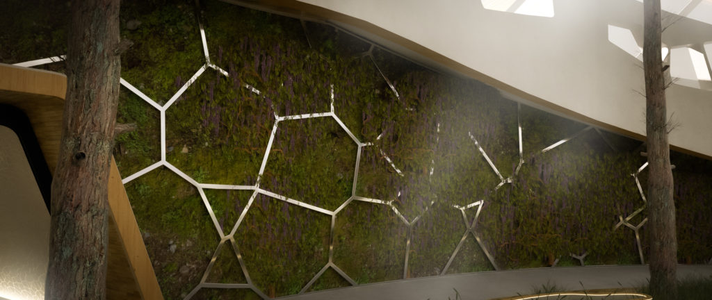
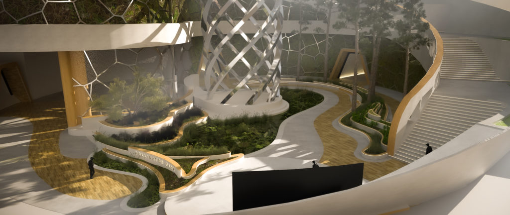
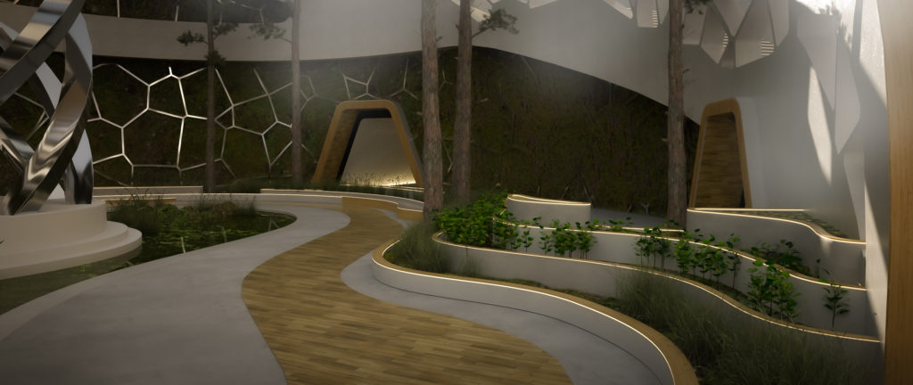
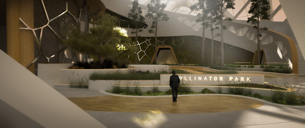
Bart iterated on our rough ideas providing us a visual representation we could use to inspire the client. Our main focus was on the inside of the park as only this would be visible to the park visitors. We envisioned it to be bright white and fresh green with light wooden elements. It should contrast nicely with the barren landscape outside…
For us this was quite a large project to pull of in a very limited time period. The whole Covid situation didn’t make things easier. Belgium was in lockdown at the time… Staying in frequent contact and constantly iterating over every step was essential. Luckily Bart and us talk the same design-language.
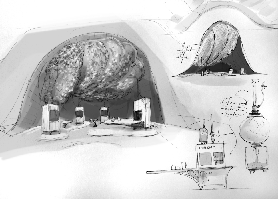
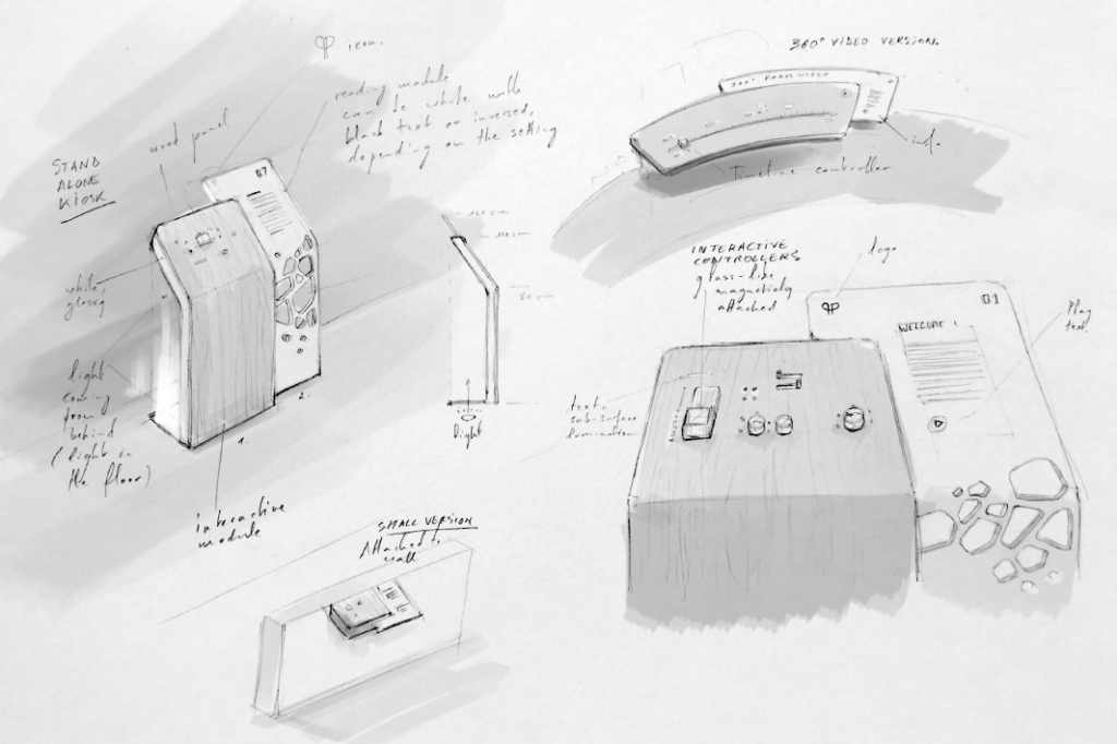
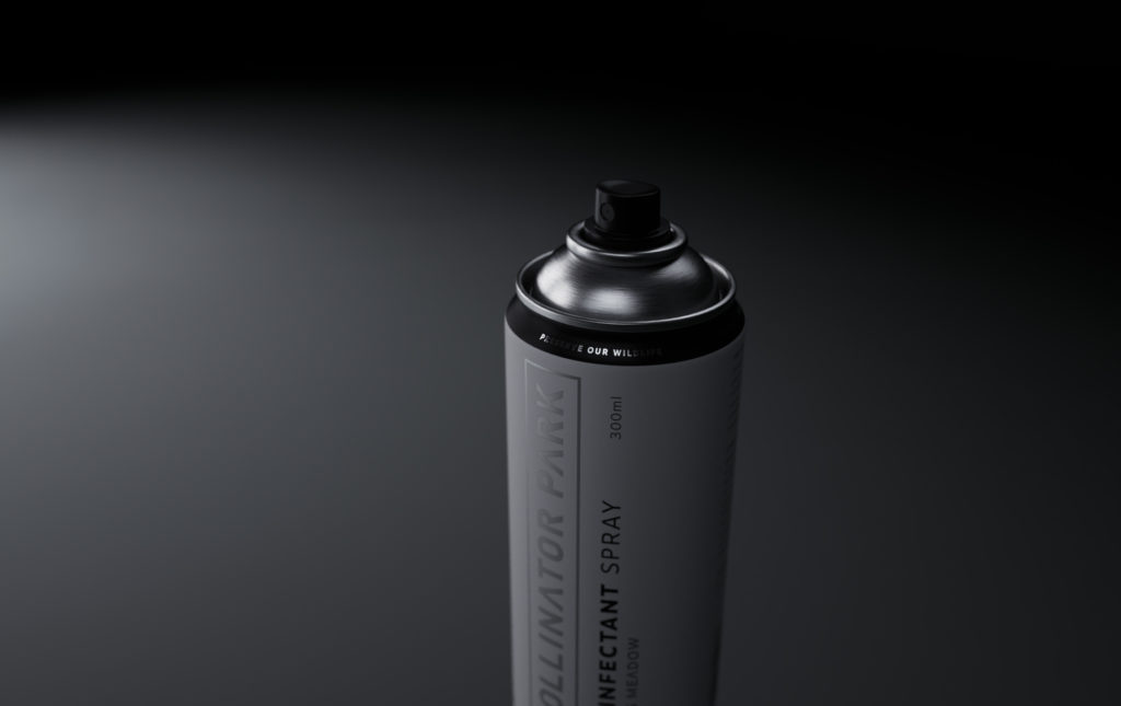
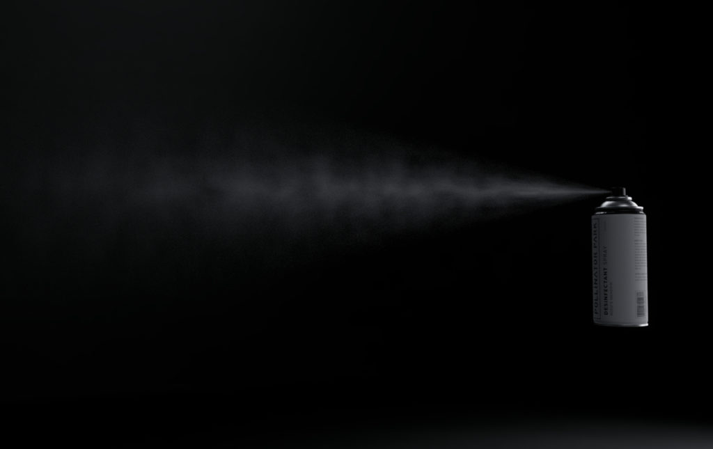
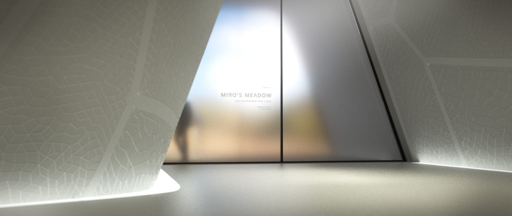
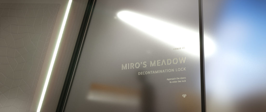
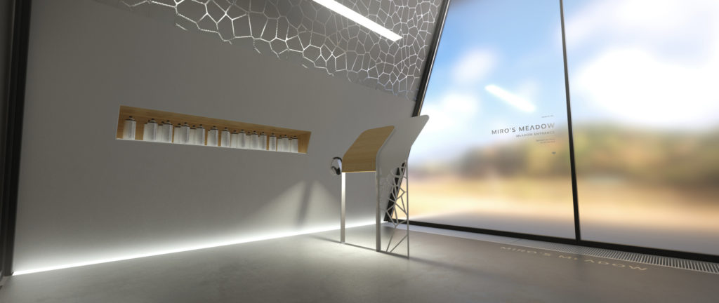
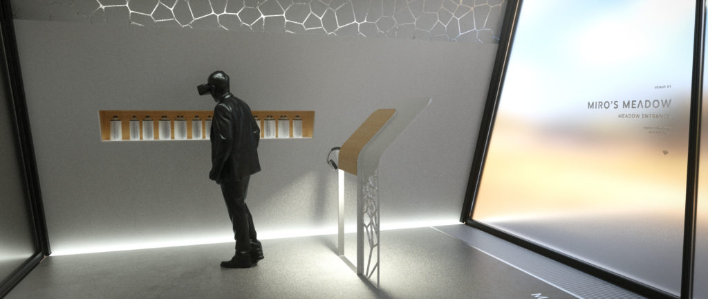
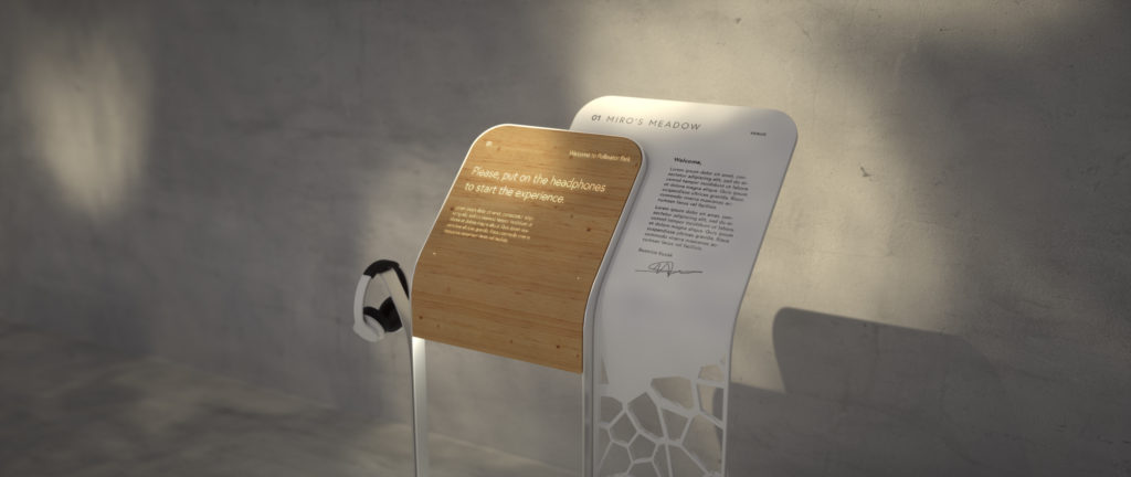
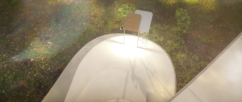
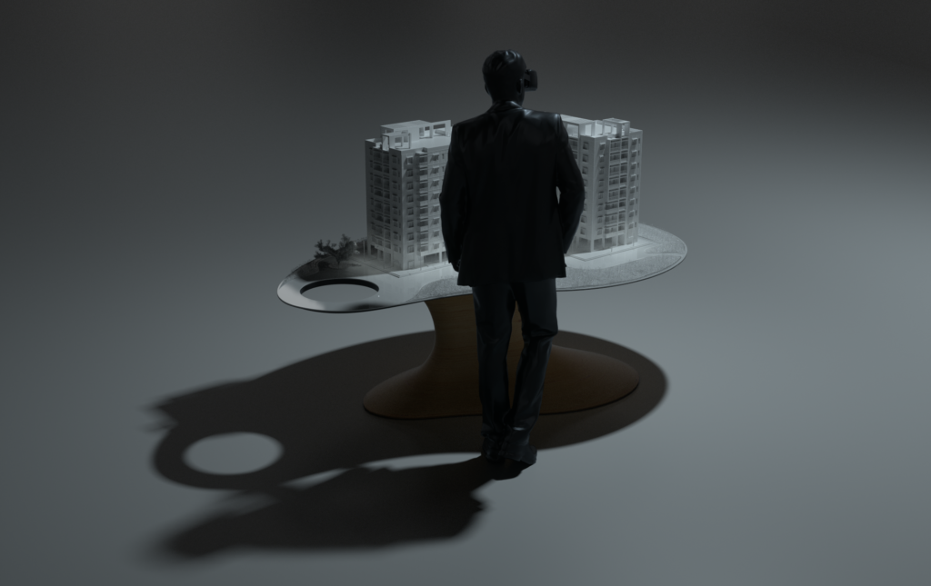
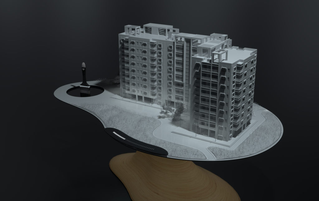
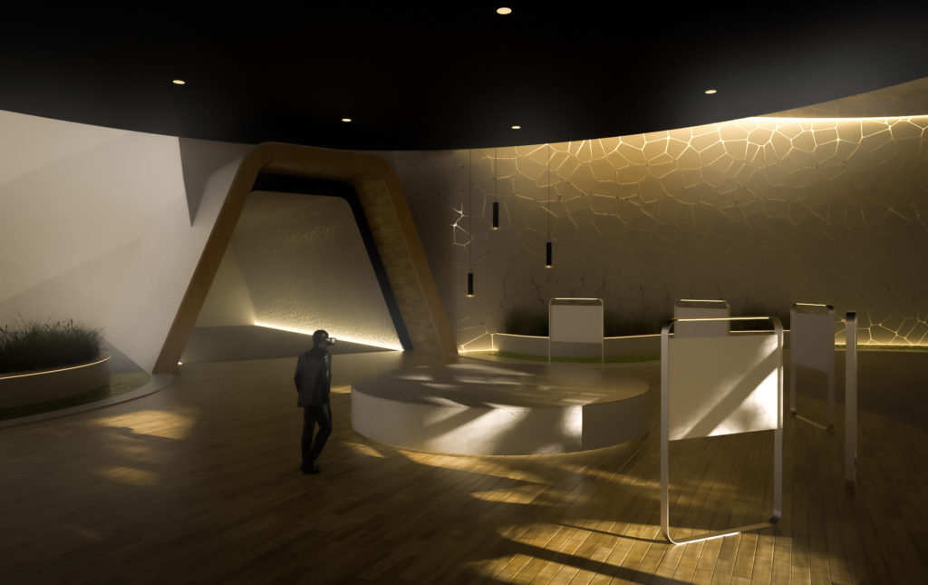
After the initial sketches were enthusiastically approved we moved on the more elaborate visualizations of some very specific elements. At this time there were still a lot of elements to be thought through from our side, but we knew our interactions would require some kind of signage displays and because of technical restrictions we would also need to have locks (more about technical stuff here). Although we removed the interaction from the final experience we gave these area a disinfecting function.
Meadow
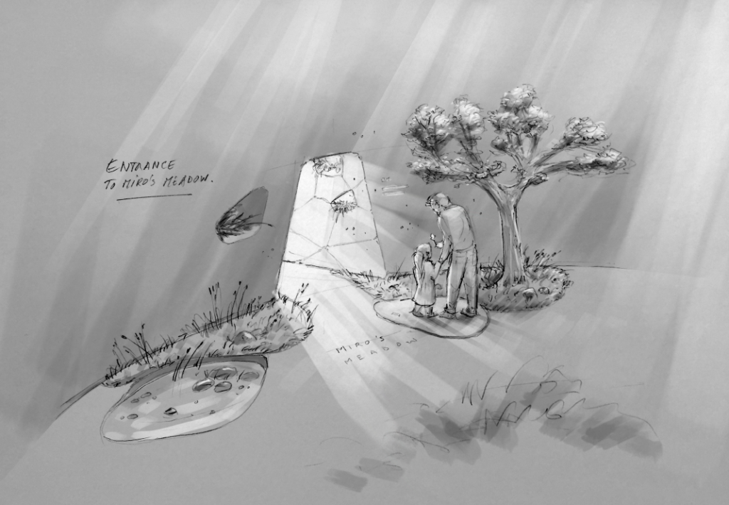
This is where a visitor would begin her journey, where we wanted to teach visitors about pollinator diversity, habitats and pollination.
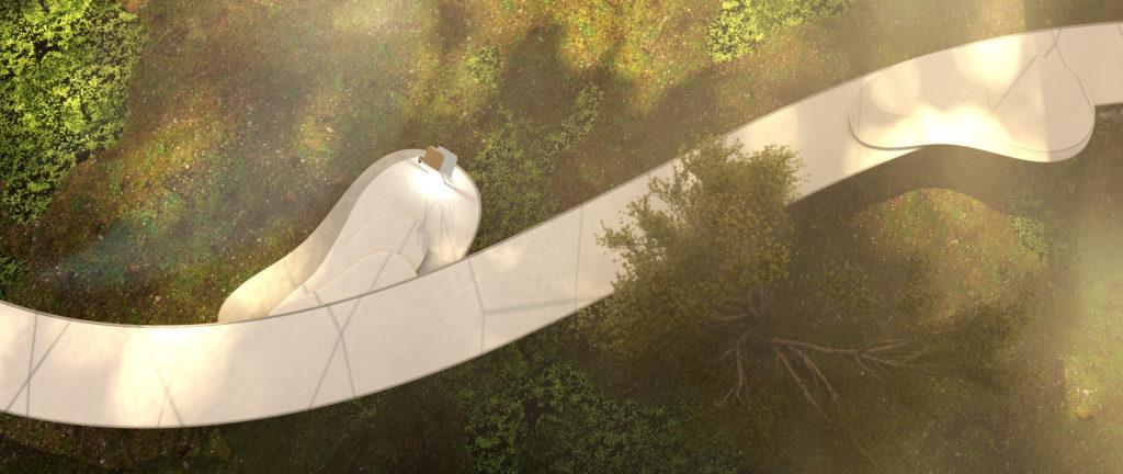
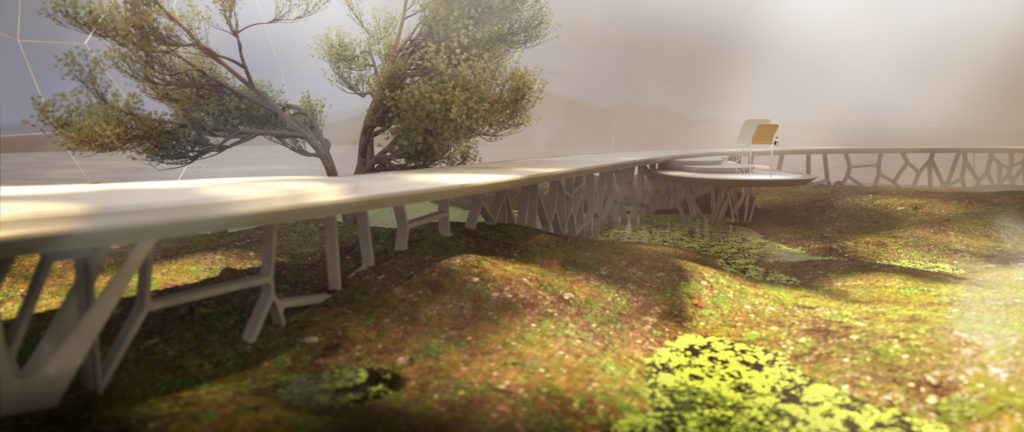
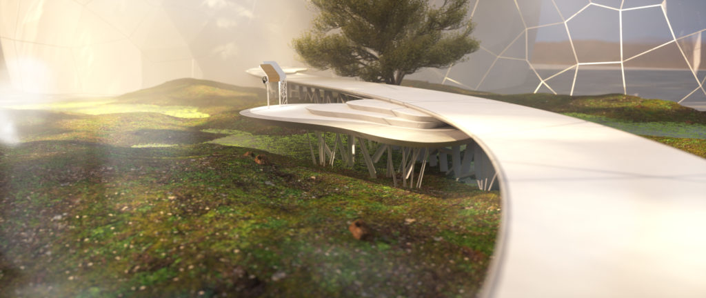
It is the largest visitable area and on a technical level definitely the most challenging one. Very early on, after A LOT of performance testing, we realised we could not let visitors roam free here. It was just too demanding on for the Oculus Quest, which was our target device for VR. Limiting visitor movement to a specified path was the only way achieve the required performance. Story wise this was no issue, we would not want park visitors to disturb our pollinators in their natural habitat by roaming freely in Beatrice’s childhood meadow 😉
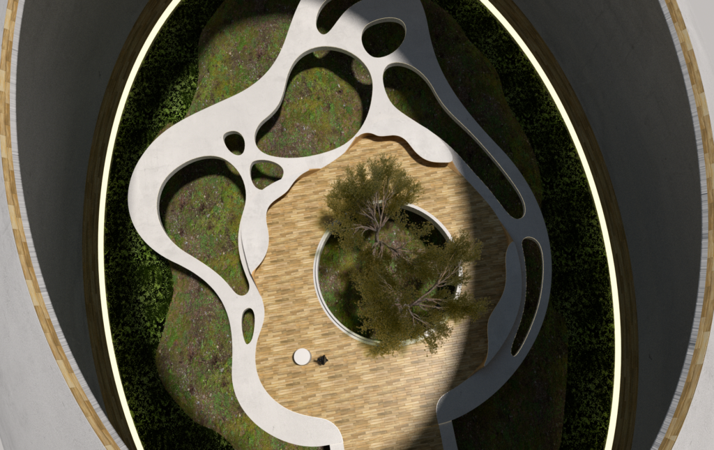
This technical restriction turn out to be a welcome feature in the design process. Bart made the path flow through the landscape like a gentle river with small lakes where the interaction points should be.
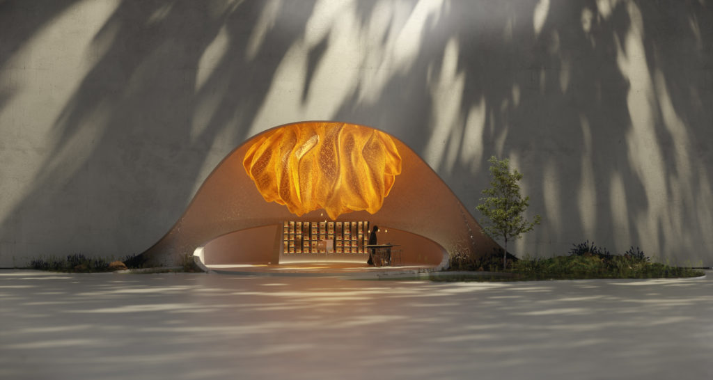
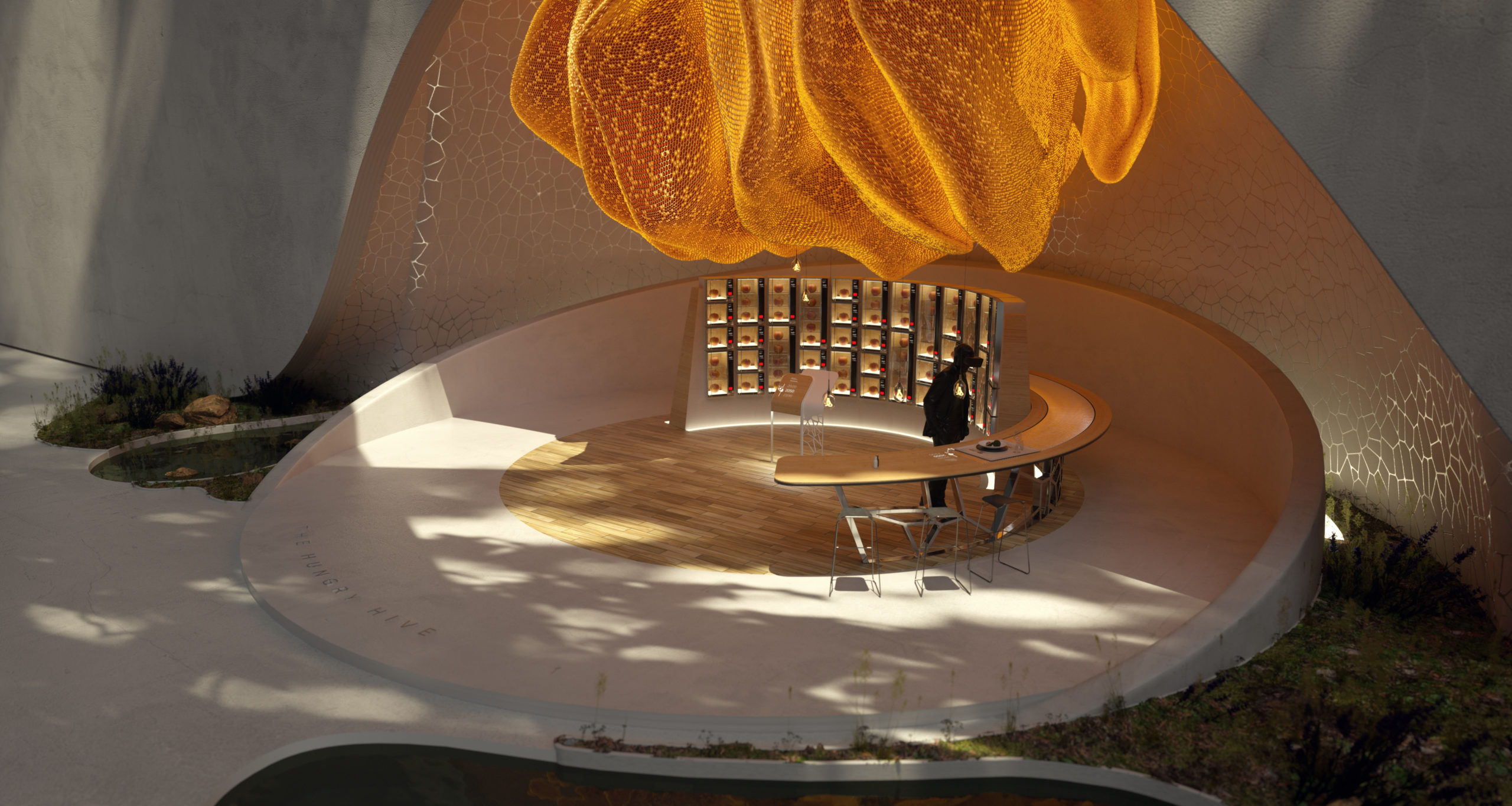
Hungry Hive
What’s the impact of pollinator decline on our food supply? Apparently almost 1/3 of our daily food depends on insect pollination in one way or another…
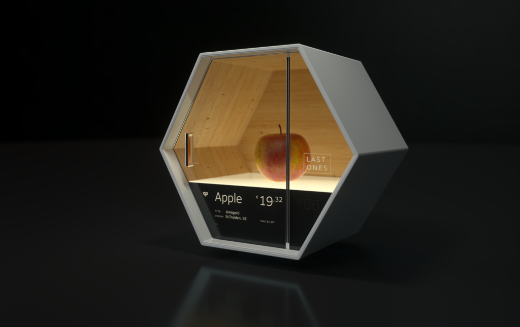
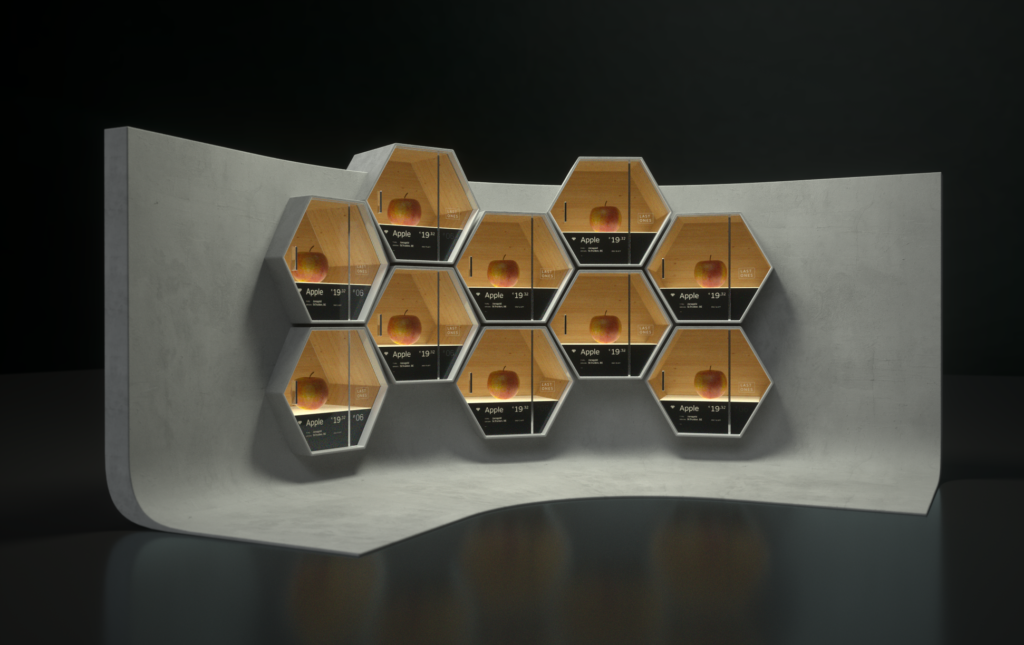
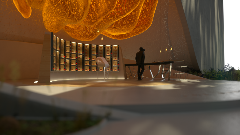
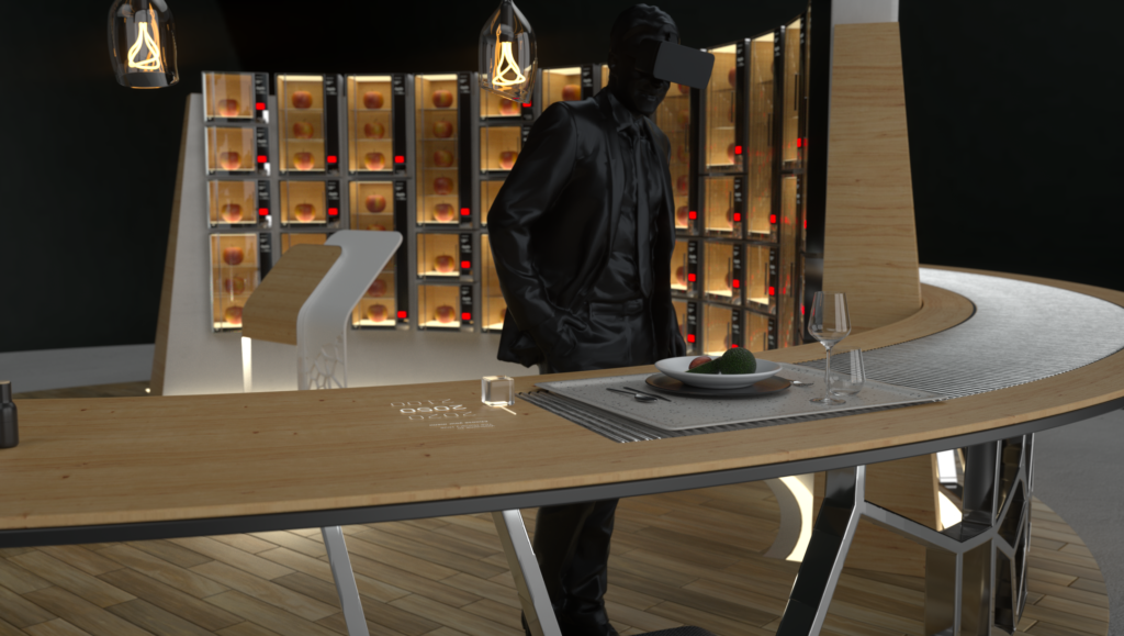
We don’t really know if this is something they have in other places in the world, but in Holland (north of Belgium where we are located), they have a thing called “kroketmuur”. It’s basically a wall with small glass-windowed heated boxes filled with (mostly) fastfood. You insert a coin and the box unlocks giving you access to one tasty snack.
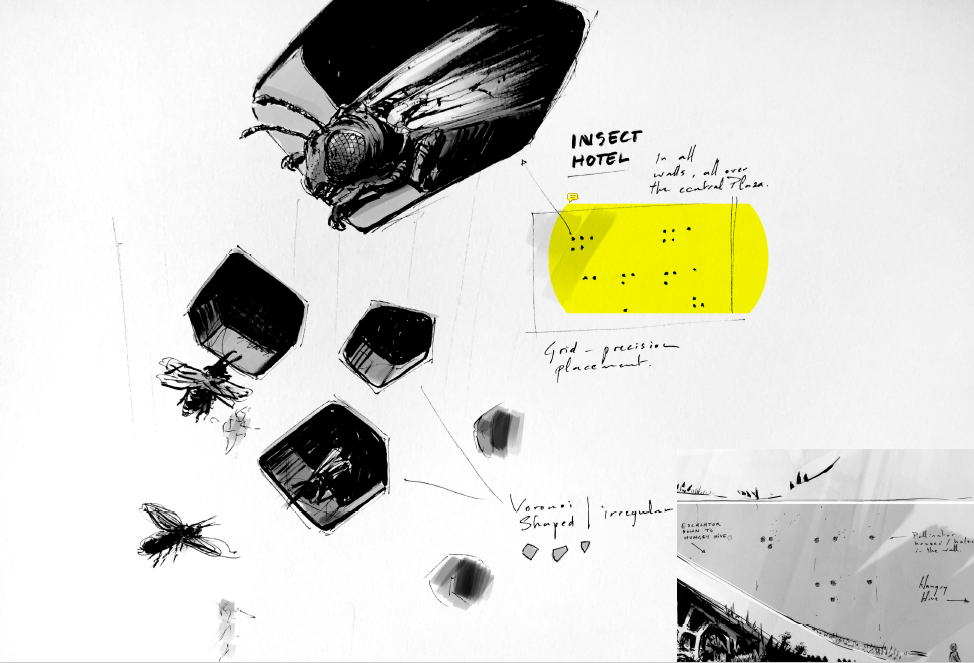
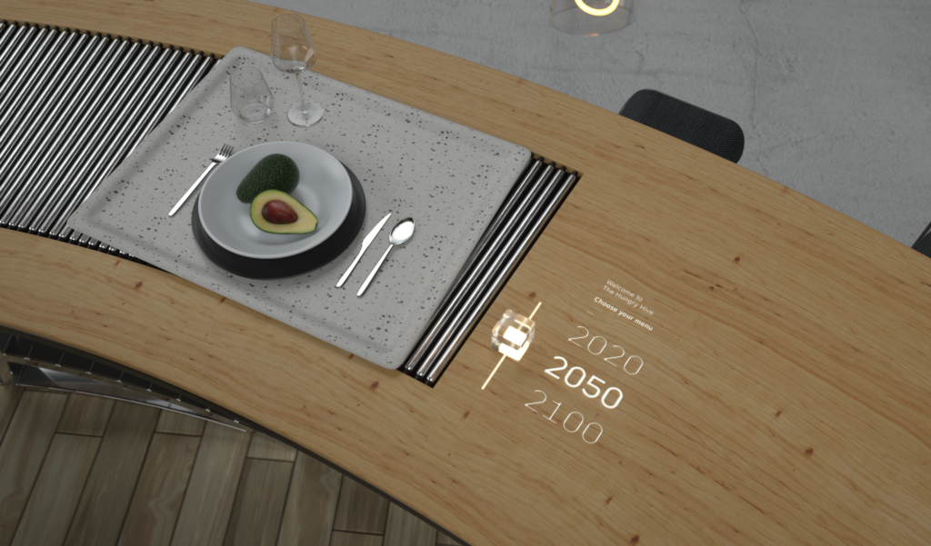
It was also a perfect way to illustrate what products would disappear from our menu the coming 10, 30 or 60 years. The initial designs were too “honeybee inspired” (something we were warned to be cautious of, especially because we already had a giant glowing hive as stylistic element there.
Urban Lab
How can we impact our environment as an individual, a community or a government. Without getting too complex… this area needed table space for interactions and was allowed to have a more urban feel…
At this point we first made contact with archibiotect Vincent Callebaut. After an initial introduction we sent him and his team all our design schetches, technical documents and story elements. Two weeks later we took the train to his office in Paris. But that’s another story… (read here)
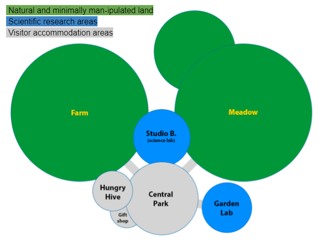
After we received the initial architectural designs we needed to make them work for our experience. From the central park we needed to have access to the 3 distinct area mentioned above and one extra area to end the experience.
Central Park Redesign
Although the new designs are based upon our initial layouts and Bart’s concept sketches, we had to make a few adjustments to connect the surrounding domes to the Central Park.
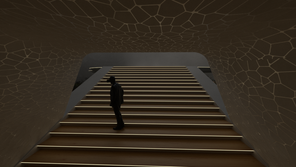
At first we wanted to make the park entrance under the the main structure, but the meadow entrance also had to start in that area. We also needed some kind of welcome area and orientation point. Maybe the most convincing point was that it just didn’t feel WAUW enough to start there. The design & architectures deserved a little more attention and the visitor would only benefit from a little more amazement.
More about Pollinator Park
- Pollinator Park
 What does it take for mankind to start caring for animal species on the verge of extinction? Actual extinction? Or…… Read more: Pollinator Park
 - Pollinator Park – Virtual Launch Show
 March 23rd 2021 – Today is the official launch of Pollinator Park. We’ve been working on this beautiful project for… Read more: Pollinator Park – Virtual Launch Show
 - The Story of Beatrice Kukac
 How one woman’s passion project became a beacon of hope in a pollinator-deprived world.
 - The Concept Art of Pollinator Park
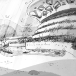 With a few diagrams and sketches, and a bunch of mood board images we reached out to Bart Lommelen (Fixion)… Read more: The Concept Art of Pollinator Park
 - The Architecture of Pollinator Park
 During our concept phase we had created various mood boards to define a look and feel for Pollinator Park. In… Read more: The Architecture of Pollinator Park
 - Press Release – World Bee Day
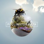 Pollinator Park Step into a beautiful virtual reality about the ugly future we face without pollinating insects
 - Belgian Game Awards 2021
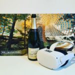 Proud to announce that Pollinator Park is Winner in the category Best non-entertainment title of the year.
 - Een wereld van verschil…
 Hoe zal de aarde eruitzien zonder wilde bijen en andere bestuivers? In de achtdelige online videoreeks ‘Een wereld van verschil’… Read more: Een wereld van verschil…
 - Host Pollinator Park at your event
 You would like to feature Pollinator Park at your event, but don’t know where to start? Most users don’t know… Read more: Host Pollinator Park at your event
